B2B SaaS для агентств, бухгалтерий и юрфирм. Спроектировал core-интерфейс платформы для сбора клиентских документов: 120k+ пользователей, 1400+ компаний, 63 страны.

Бухгалтеры, юристы, ипотечные брокеры, диджитал-агентства — у всех одна и та же боль. Перед каждым проектом нужно собрать с клиента десятки документов и форм, и это превращается в недели переписки. Клиент забывает, теряет файлы, отвечает на одно письмо из пяти, присылает скан вместо PDF. В итоге, половина рабочего дня уходит на «ну как там дела?».
Content Snare появился, чтобы снять эту боль. Агентство собирает структурированный запрос, отправляет клиенту одну ссылку и получает обратно заполненную форму. Концепция работает при одном условии: клиент должен дойти до конца сам.
Продукт покупает агентство, но успех решает его клиент. Человек, которому прислали ссылку, не проходил онбординг, не читал документацию и не вернётся, если застрянет. Весь интерфейс проектировался с его точки зрения.
Лучший интерфейс для клиента тот, который он не замечает. Поэтому каждое решение проверялось одним вопросом: не добавляет ли оно еще одно «что мне здесь делать?»
Агентству нужно другое: шаблоны под повторяющиеся проекты, условная логика, лимиты по длине и типам файлов, кастомизация бренда, контроль над тем, что считается «готовым», а что «нужно переделать».
Целевая аудитория Content Snare — соло-юристы, маленькие бухгалтерии, диджитал-агентства из нескольких человек. Для них глубина обнаруживается постепенно: простые сценарии работают сразу, сложное раскрывается по мере необходимости.
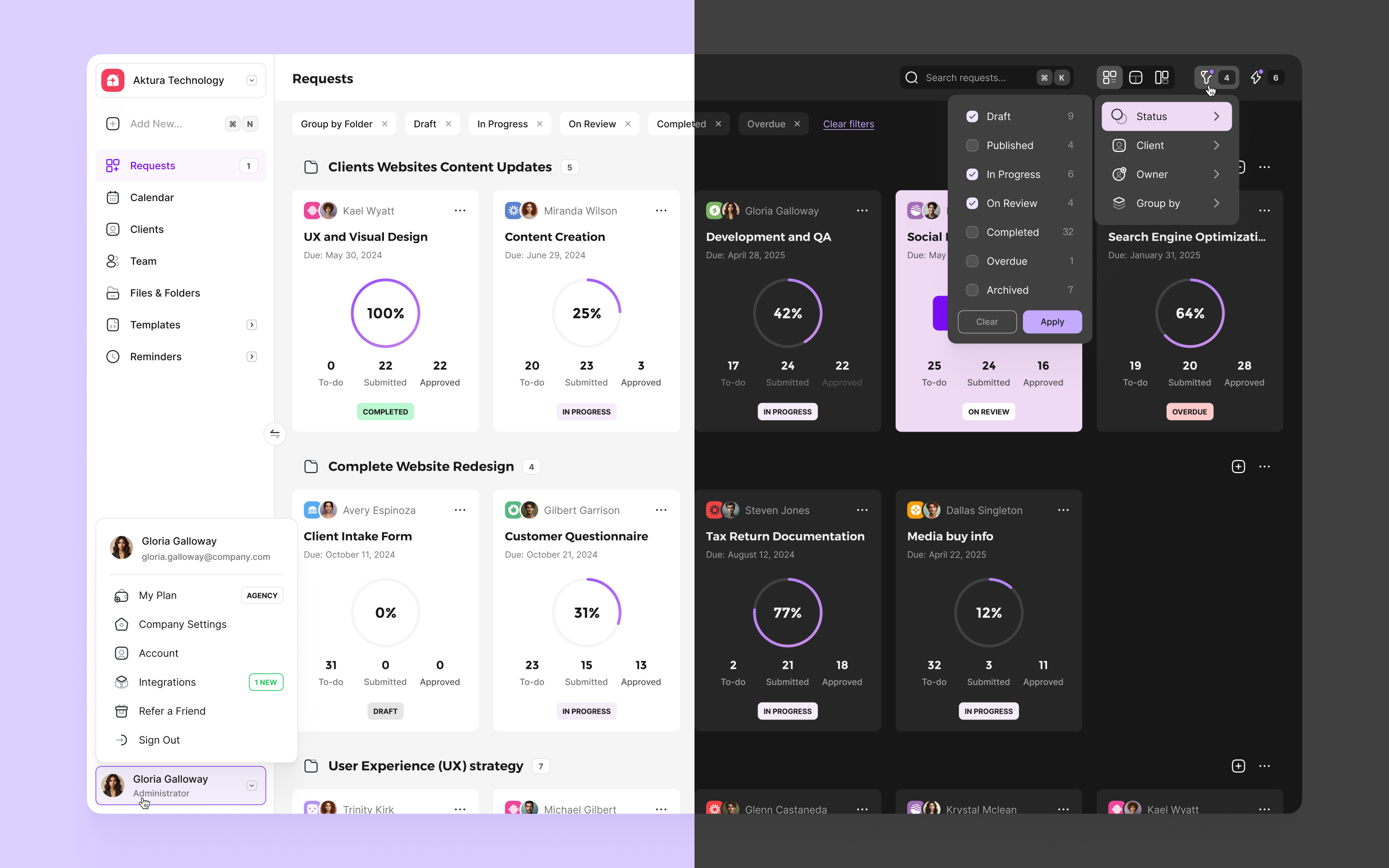
Главным экраном агентства является список всех активных запросов. Каждая строка показывает, какому клиенту что отправлено, на какой стадии запрос, сколько полей осталось, когда был последний ответ. Менеджер сканирует список за секунды и видит, где буксует процесс, без необходимости заходить в каждый запрос.
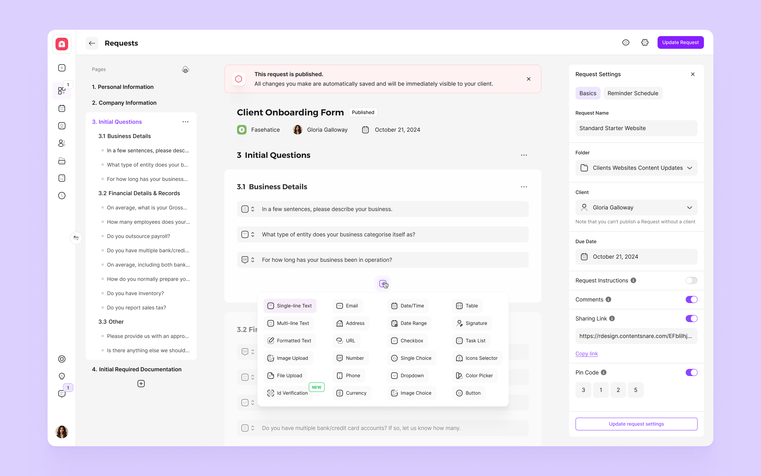
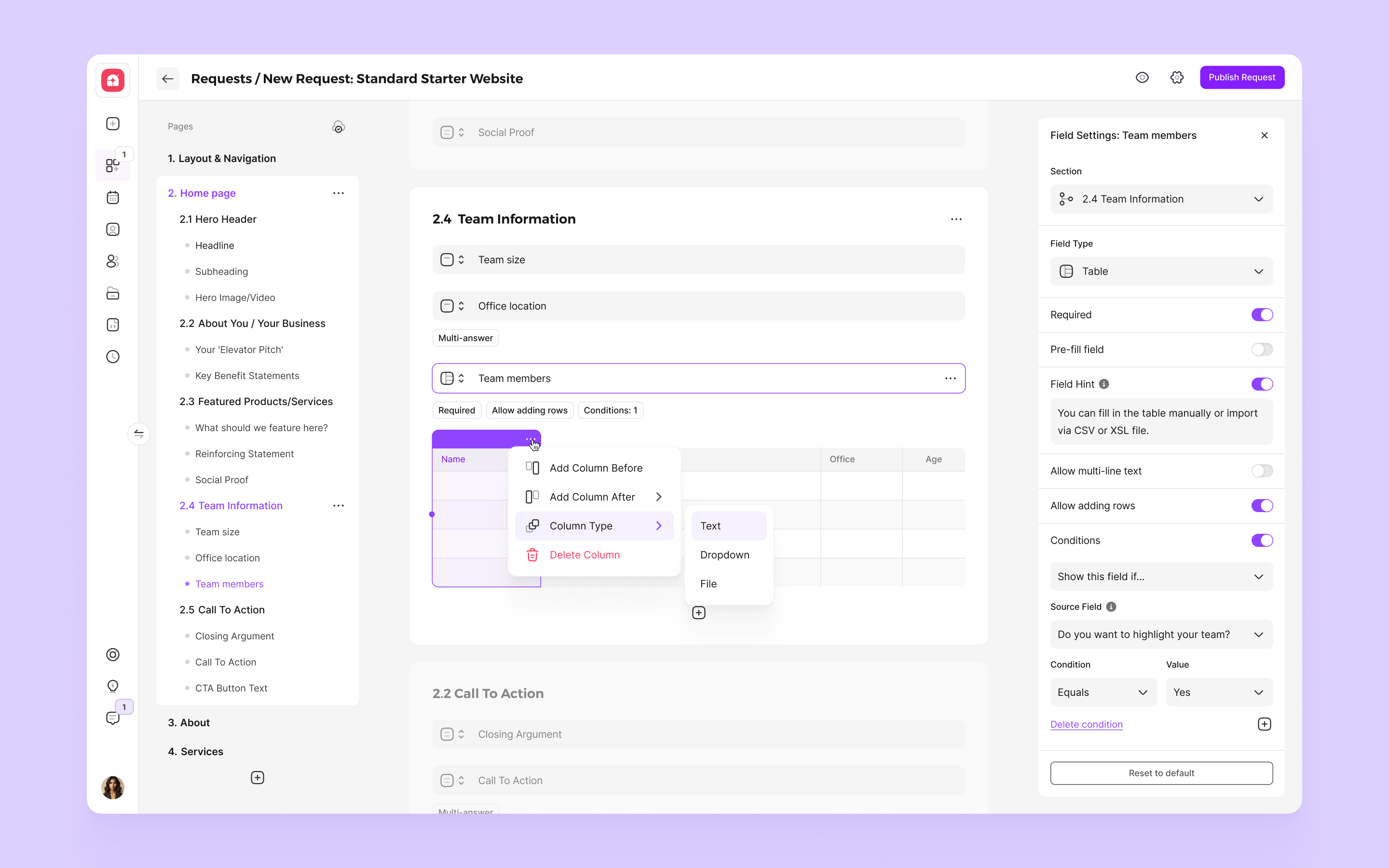
Сердце продукта на стороне агентства. Запрос строится из секций и полей. Внутри полей текст, файлы, таблицы, выбор из вариантов. Каждое поле может иметь правила: минимальная длина, тип файла, размер, обязательность. Условная логика прячет или показывает поля в зависимости от того, что клиент уже ответил. Это снимает лишние вопросы с клиента и делает форму короче, чем она кажется.
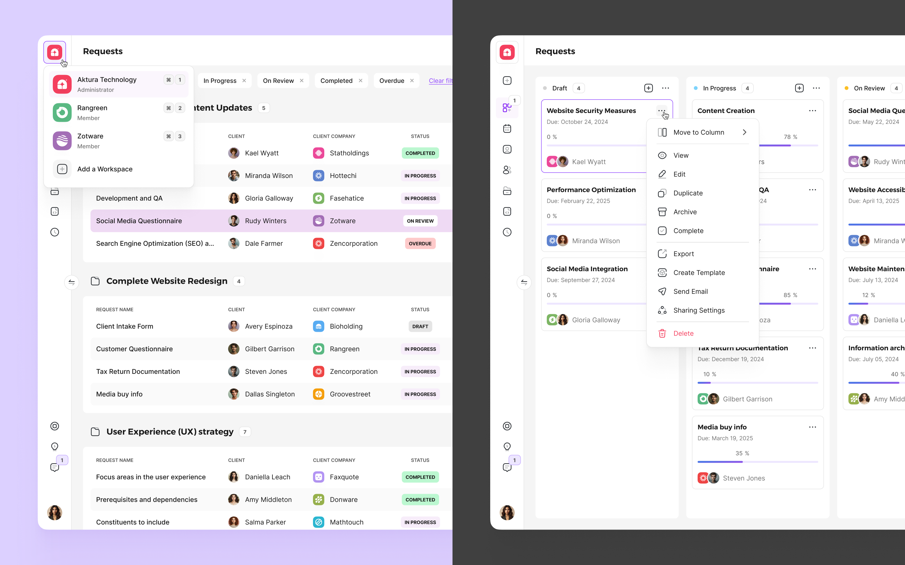
Если агентство собирает одни и те же документы раз за разом — оно один раз настраивает шаблон, и дальше каждый новый запрос создаётся в пару кликов. Любой в команде может взять готовый шаблон коллеги и отправить его новому клиенту, не повторяя настройку с нуля. Это та фича, которая превращает Content Snare из инструмента для одного запроса в инструмент для повторяющегося процесса.
Disclaimer: Все показатели являются приблизительными и округлены для удобства восприятия. Точные цифры конфиденциальны и защищены соглашением о неразглашении.
В Content Snare я впервые столкнулся с продуктом, где главный пользователь — невидимка. Я не разговаривал с клиентами агентств, не наблюдал, как они заполняют формы, не получал прямого фидбека. Все сигналы были косвенные: процент завершённых запросов, тикеты в поддержку, описания типовых жалоб.
Дизайн в такой ситуации становится упражнением в эмпатии без обратной связи. Приходится представлять человека, для которого работаешь, и проверять каждое решение через фильтр «справится ли он, если у него нет ни времени, ни опыта с продуктом».
We worked with Raph over several years and his designs were always top-notch. He has an eye for making interfaces just look good - a talent that's surprisingly hard to find.

B2B SaaS for agencies, accounting firms, and law firms. Designed the core interface of a client document collection platform: 120k+ users, 1400+ companies, 63 countries.
Accountants, lawyers, mortgage brokers, digital agencies — they all share the same pain. Before every project, they need to collect dozens of documents and forms from clients, and it turns into weeks of back-and-forth. Clients forget, lose files, reply to one email out of five, send a scan instead of a PDF. Half the workday goes to "so, how's it going?"
Content Snare was built to relieve this pain. The agency creates a structured request, sends the client a single link, and gets back a completed form. The concept works on one condition: the client must make it to the end on their own.
The agency buys the product, but the client decides whether it succeeds. The person who receives a link hasn't been onboarded, hasn't read the documentation, and won't come back if they get stuck. The entire interface was designed from their perspective.
The best interface for the client is the one they don't notice. Every decision was tested against one question: does this add another "what am I supposed to do here?"
The agency needs something different: templates for recurring projects, conditional logic, length and file type limits, brand customization, control over what counts as "done" and what needs revision.
Content Snare's target audience is solo lawyers, small accounting firms, and two-person digital agencies. For them, depth is revealed gradually: simple scenarios work right away, complexity surfaces only when needed.
The agency's main screen is a list of all active requests. Each row shows which client received what, what stage the request is at, how many fields are left, and when the last response came in. The manager scans the list in seconds and sees where the process is stalling, without opening each request individually.
The heart of the product on the agency side. A request is built from sections and fields. Fields can contain text, files, tables, or selection options. Each field can have rules: minimum length, file type, size, required status. Conditional logic hides or shows fields based on what the client has already answered. This removes unnecessary questions from the client and makes the form shorter than it looks.
If an agency collects the same documents again and again, they configure a template once, and every new request is created in a couple of clicks. Anyone on the team can pick up a colleague's template and send it to a new client without repeating the setup from scratch. This is the feature that turns Content Snare from a one-off tool into a system for repeatable process.
Disclaimer: All metrics are approximate and rounded for readability. Exact figures are confidential and covered by NDA.
At Content Snare, I encountered for the first time a product where the main user is invisible. I never spoke with agency clients, never watched them fill out forms, never received direct feedback. All signals were indirect: the percentage of completed requests, support tickets, descriptions of common complaints.
Design in this situation becomes an exercise in empathy without feedback. You have to imagine the person you're designing for and test every decision through one filter: will they manage if they have no time and no prior experience with the product?
We worked with Raph over several years and his designs were always top-notch. He has an eye for making interfaces just look good - a talent that's surprisingly hard to find.
